Active for Animals platform redesign
- Problem
- Active for Animals offers a wide range of tools, and their full value wasn't always easy for new users to discover.
- Solution
- I audited the platform's services and user needs, then explored a redesigned structure and onboarding experience built around what users come to do.
- Outcome
- A fully interactive prototype that gives Active for Animals a starting point for developing a redesigned experience and testing it with their customers. Try the prototype.
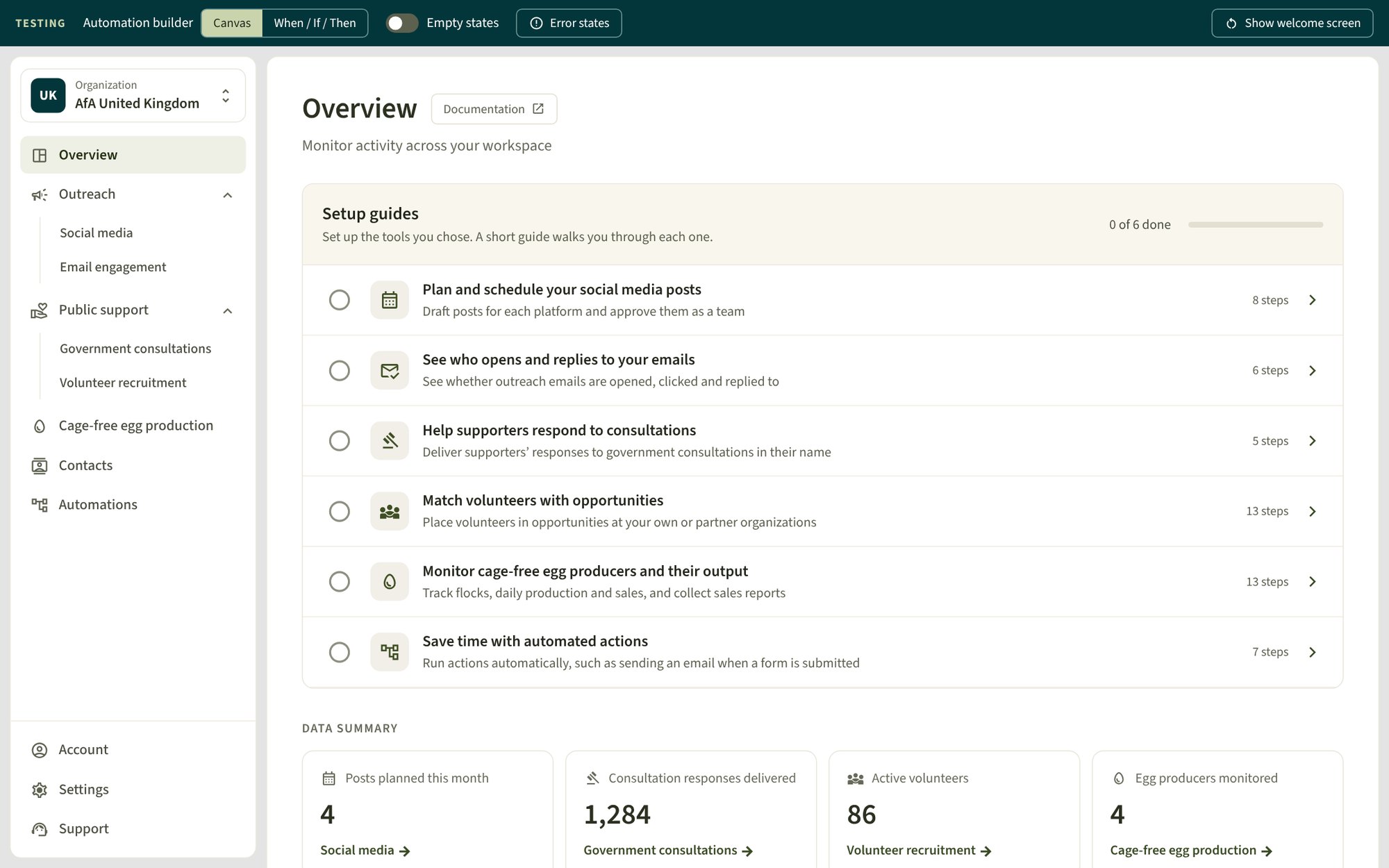
A wide range of tools in one platform
Active for Animals offers a platform of tools for animal advocacy organisations. Teams can plan social media, track engagement with their emails, rally supporters to respond to government consultations, match volunteers with opportunities, and monitor cage-free egg production.
At the time of this project, each tool had its own tab. This keeps every tool easy to find by name, but means the connections between tools, and which ones suit a particular goal, aren't always visible to someone new to the platform. As Active for Animals adds more tools, there was an opportunity to guide new users straight into the work they came to do.
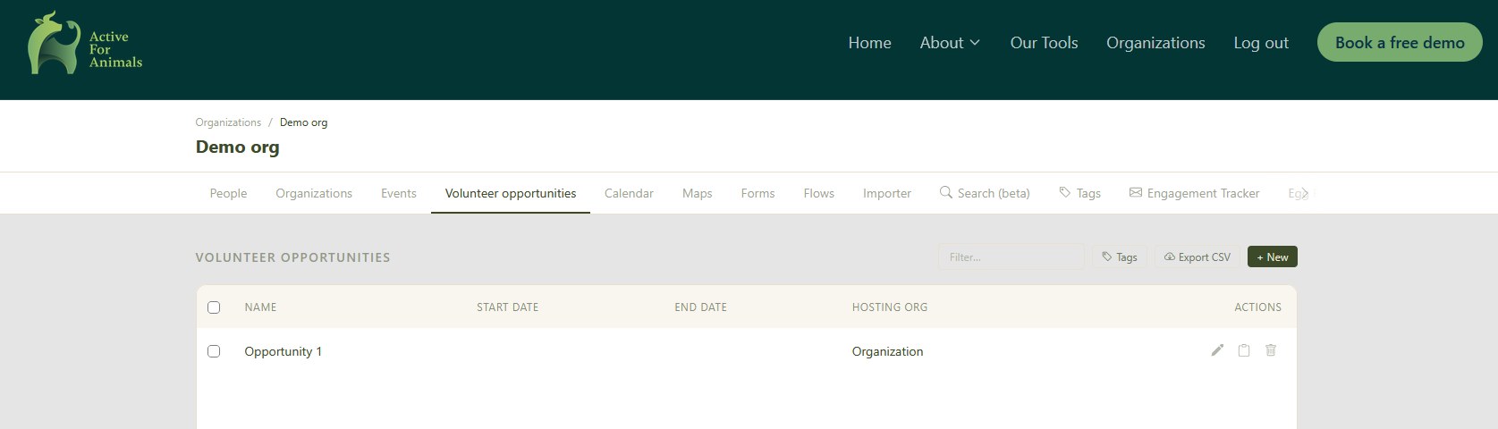
This voluntary project explored that opportunity. The live platform remains Active for Animals' own product, and the prototype is a starting point for their own development and testing.
Mapping the platform with OOUX
Before redesigning anything, I reviewed every current service, the existing feedback, and the tools Active for Animals was considering for the future. Using object-oriented UX (OOUX), I mapped the following in Figma:
- User goals, such as placing volunteers in opportunities
- Record types users create and manage, such as people, events and egg producers
- Tools that act on those records, such as forms, maps and the social media planner
- User groups and external services, such as volunteers and government consultation portals
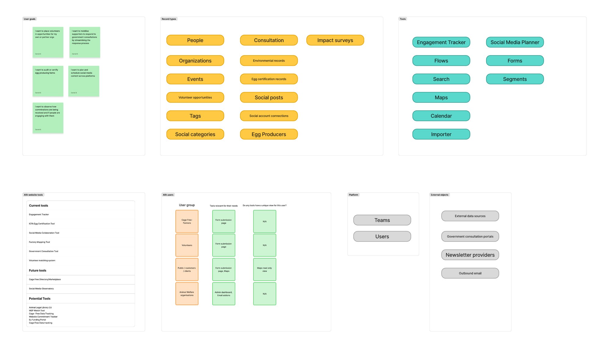
The map showed how many records were shared between tools. Forms, for example, support volunteer recruitment, consultations and egg certification, which each had their own tab.
Auditing the existing experience
Next, I walked through every area of the platform as a new user would, auditing its content and accessibility. I captured each area as annotated screenshots on a shared Figma board, which the site owners and I used for async back-and-forth discussions about the existing experience.
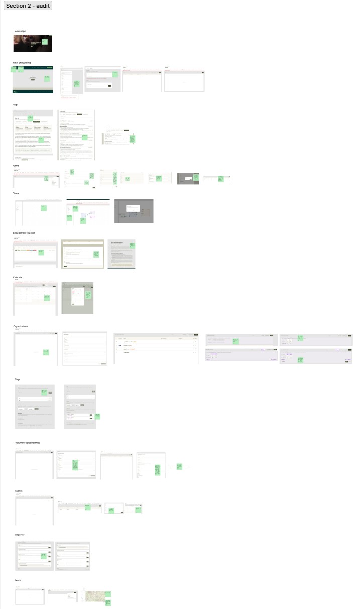
The platform already had strong foundations: some services were grouped into records, tools and dashboards, the Engagement Tracker had its own documentation, and the help pages held useful guidance with tags to filter tips by use case. The audit focused on building on these strengths.
An opportunity for guided onboarding
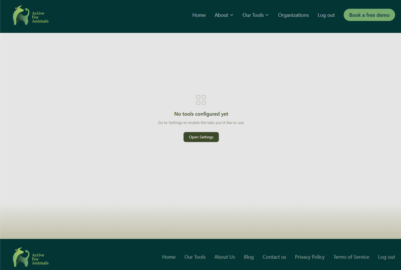
As a new user, I wasn't sure how to get from the website into the application. Once inside, the first screen linked to Settings, which left room to guide new users towards the tools that suit their goals.
Making connections between records more visible
Some useful relationships between records could be surfaced more clearly. For example, matching volunteers with opportunities relies on people records, which are created in a separate People tab. Suggesting users add people first, from the page they're working on, would help them make the most of these features.
Feedback and accessibility
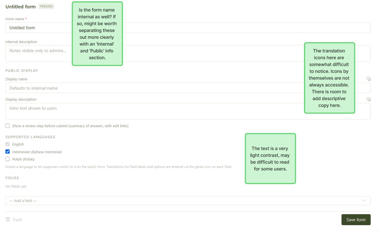
Small changes could make actions clearer and more accessible, such as text labels alongside icons and stronger contrast for lighter text.
Restructuring around what users come to do
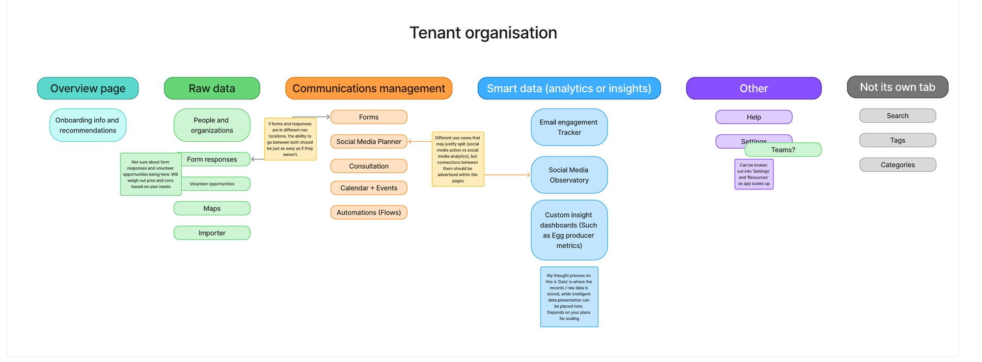
The existing platform already sorted some of its services into records, tools and dashboards. I extended this idea to the whole platform, drafting a structure that separated raw data, communications management and analytics.
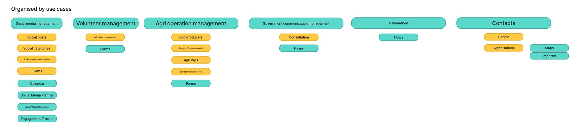
Grouping by use case matched the user goals from the OOUX map more closely: people arrive wanting to recruit volunteers or plan a campaign, not to find a record type.
Naming and content hierarchy
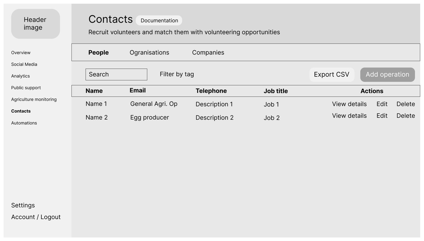
I turned the use-case structure into basic wireframes in Figma and shared them with the site owners. Most of our back-and-forth feedback focused on the content hierarchy and naming. Each name had to be meaningful to current and future users, based on the value they want from the platform rather than how the platform is built.
In the prototype, existing tools sit under names that describe what users get from them:
| Existing tab | In the prototype | Reason for the change |
|---|---|---|
| Social Media Planner | Social media, under Outreach | Grouping it under Outreach places it with other tools focused on public communications. |
| Engagement Tracker | Email engagement, under Outreach | Says what is being tracked, so users know it's about their emails before opening it. |
| Consultation | Government consultations, under Public support | Makes clear who the consultations are with, which helps users who are new to this kind of campaigning. |
| Volunteer opportunities | Volunteer recruitment, under Public support | Describes the goal rather than one type of record, as the page brings together opportunities, volunteers and the forms that connect them. |
| Egg Producers | Cage-free egg production | Describes the work being monitored, as the area covers flocks, daily production and sales as well as producers. |
| People and Organizations | Contacts | Brings all of the records that users work with, including people, organisations and companies, into one place. |
| Flows | Automations | Says what the tool does. “Flows” may be less clear to users who haven't used automation tools before. |
These names are a starting point. Whether each one is clearer than the original will depend on user testing with Active for Animals' customers.
Onboarding built around tasks
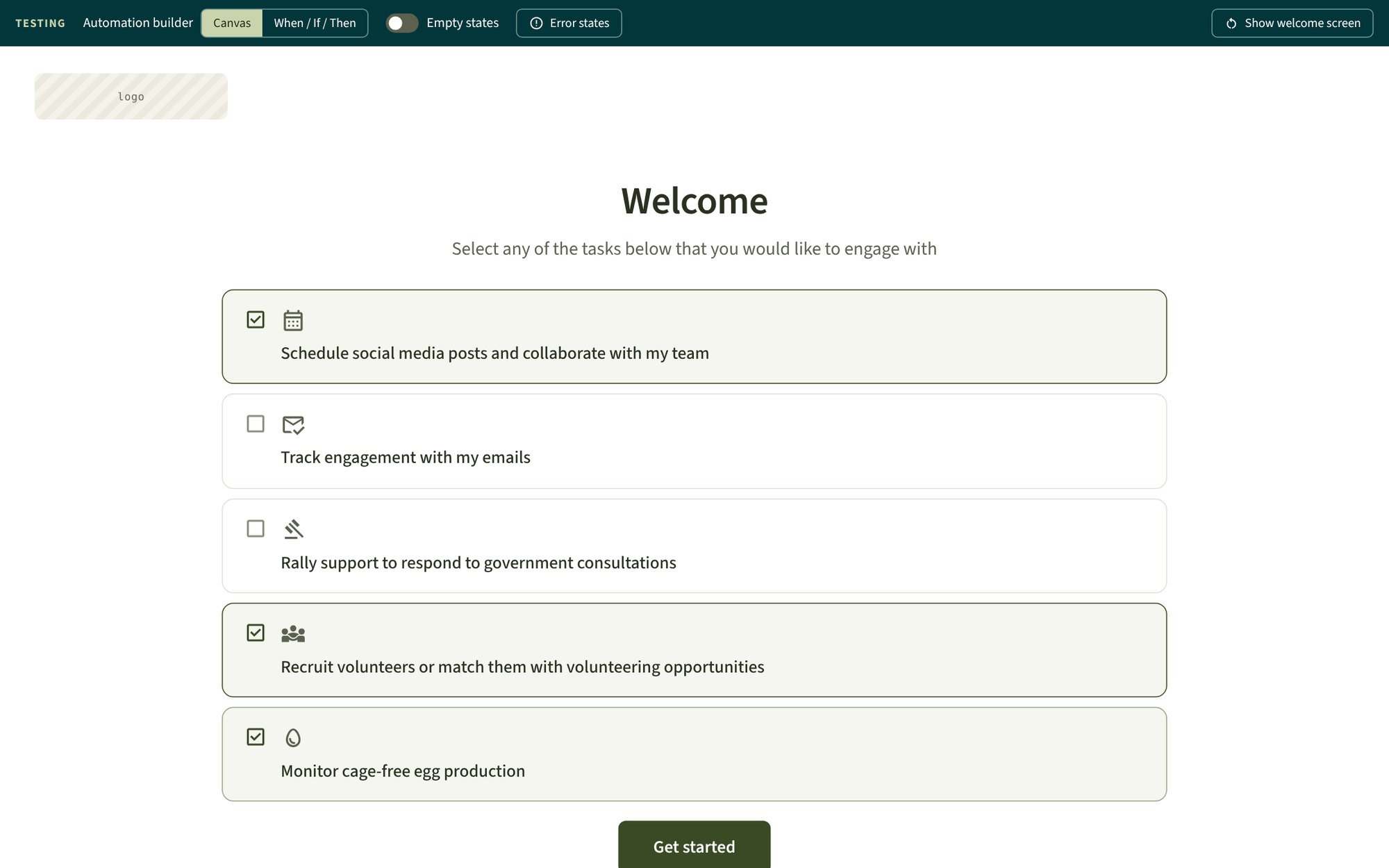
The redesigned onboarding starts by asking users what they want to do, not which tools they want to turn on.
-
01
Welcome screen
Users pick the tasks they came to do, and the side navigation is tailored to them. It can be changed in Settings at any time.
-
02
Overview
A guided section for each chosen task, with its progress. Automations are always included, as they work across every task.
-
03
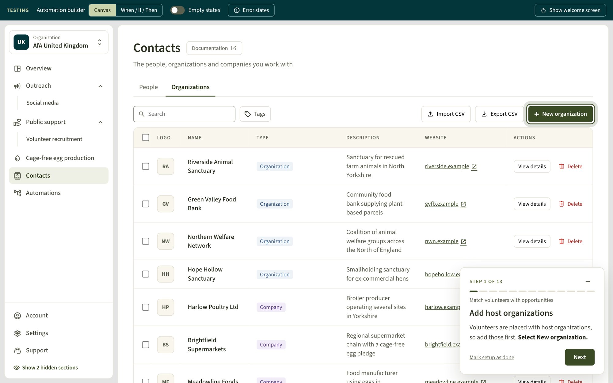
Guide panel
A guide walks through each step on the real screens, highlights the button to select, and moves on once the user completes the action.
Content design decisions
Alongside the prototype, I documented its design, content and accessibility decisions, with a checklist for adding new product areas consistently. These are the content decisions with the biggest impact.
Before and after
| Screen | Existing platform | Prototype |
|---|---|---|
| First screen after logging in | The heading “No tools configured yet”, with a message asking users to go to Settings to enable the tabs they'd like to use. | A welcome screen asks which tasks users would like to engage with, such as “Recruit volunteers or match them with volunteering opportunities”, and tailors the navigation to their choices. |
| Volunteer page | The table is headed “Volunteer opportunities”, with no page description. | The page is renamed “Volunteer recruitment” and describes what it helps users do: “Recruit volunteers and match them with volunteering opportunities”. |
| Automations page | The tab is called “Flows”. | The page is renamed “Automations”, with the description “Automate actions to occur after another action has completed, such as sending automatic emails”. |
| Saving without a name | The save button is greyed out until a name is entered. | The save button stays active, and selecting it shows “Enter a name” below the field. |
Every button verb has one job
Users should always know whether a button will save something, so each verb has one meaning.
| Verb | When to use it |
|---|---|
| New [thing] | Starts a flow, such as New post or New form. It opens a dialog, panel or builder and never saves. |
| Continue | Moves to the next step of a flow without saving. |
| Create [thing] | The final button that makes the thing, such as Create form. Used once per flow. |
| Save changes | Commits edits to something that already exists. |
| Add [thing] | Puts something into a thing that already exists, such as Add a question or Add tag. |
Descriptions lead with value
Every page has a one-line description of what its tools help the user achieve, not what the page contains. Onboarding sections are titled by outcome in the same way, such as “See who opens and replies to your emails”.
Errors say what's wrong and how to fix it
Errors name the specific problem, then the fix. For example: “This link isn't from SmartSurvey. Copy the link from the consultation page and try again.”
One action per guide step
Each guide step names the task, gives at most one sentence on why it matters, then a single action, naming the button exactly as it appears on screen. Guides never ask users to do something they can't undo just to finish a step.
From wireframes to a working prototype
Access to customer feedback was limited during the two months of the project, so I used AI-assisted development to build a working prototype. Active for Animals' developers are now testing it with their customers. It's a starting point, built to be iterated on as feedback comes in.
Building on the audit
| Audit observation | Changes made |
|---|---|
| New users start in Settings to choose their tools | A welcome screen asks what users want to do and tailors the navigation. Every empty state has a title, one sentence and a button to create the first record. |
| Related tools sit in separate tabs | Pages are grouped by use case, and each page says what its tools help the user achieve. |
| Some save buttons are disabled until a form is complete | Buttons stay clickable. Selecting one shows what still needs filling in, next to the field. |
| Saving a form closes the dialog without a message | A short message confirms what just happened, such as "Opportunity saved". Errors stay on screen and are never shown in these messages. |
| Some actions use an icon on its own | Actions are labelled with text. Delete buttons always say "Delete", and links that open a new tab say so. |
| Some lighter text could be hard to read | Text keeps at least 4.5:1 contrast. Borders and icons that show state keep at least 3:1. |
Leaving decisions open for user testing
A testing bar lets the team review states that are hard to reach in a demo, such as empty states and every error state in one place. It also lets them compare alternatives where the right answer depends on the audience.
The automation builder is one example. It can switch between a drag-and-drop canvas and a When / If / Then list. Which layout works better depends on how Active for Animals' customers use automations, so I've encouraged the developers to test both with them.
Try the prototype
The prototype below is fully interactive. Some things to try:
- Choose one or more tasks on the welcome screen, then select Get started
- On the Overview page, start a guide and follow it through the real screens
- Use the testing bar at the top to show empty states and error states
The prototype works with a keyboard and was designed for desktop screens. Use the skip link to move past it without tabbing through every control, or open it in a new tab for more space.
Results and next steps
-
A fully interactive prototype, now being tested by Active for Animals' developers with their customers
-
A proposed use-case structure and task-based onboarding, building on an OOUX map and an audit of every existing tool
-
A documented set of design, content and accessibility decisions for adding new product areas consistently
What testing needs to answer
Several decisions in the prototype involve trade-offs that only testing with real customers can settle:
- Do the new names match how customers describe their own work?
- Grouping by use case means some tools, such as forms, appear in several places. Does this help people who work across use cases, or make tools harder to find?
- Existing customers know the current tab names. What support will they need to move to the new structure?
The prototype was built to change based on these answers.