Designing content for customers experiencing active incidents
Cloudforce One REACT (Respond, Evaluate, Assess, Consult Team) is a new suite of incident response and security services designed to help organisations stop active cyberattacks and recover from previous ones. The service spans two distinct modes: emergency incident response for active crises, and advisory services. The core content challenge was that both would live inside the same product, but the people reaching for them would be in radically different states of mind.
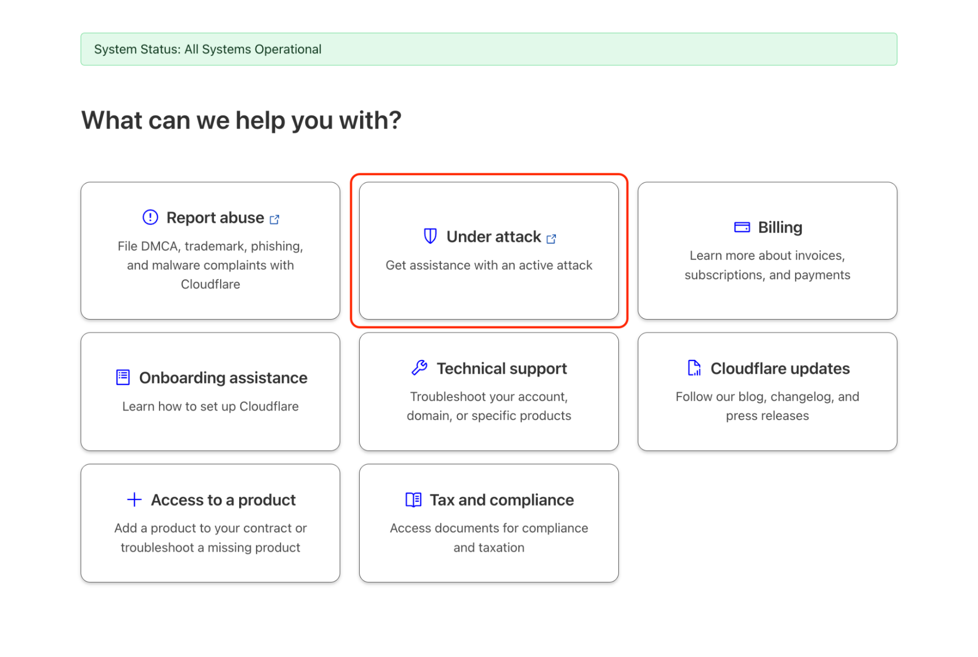
One dashboard. Two completely different users.
A security team scrambling during a live ransomware attack is in a different cognitive state to one calmly booking a tabletop exercise. Content and structure that serves one could easily fail the other.
User state A
In the middle of an emergency
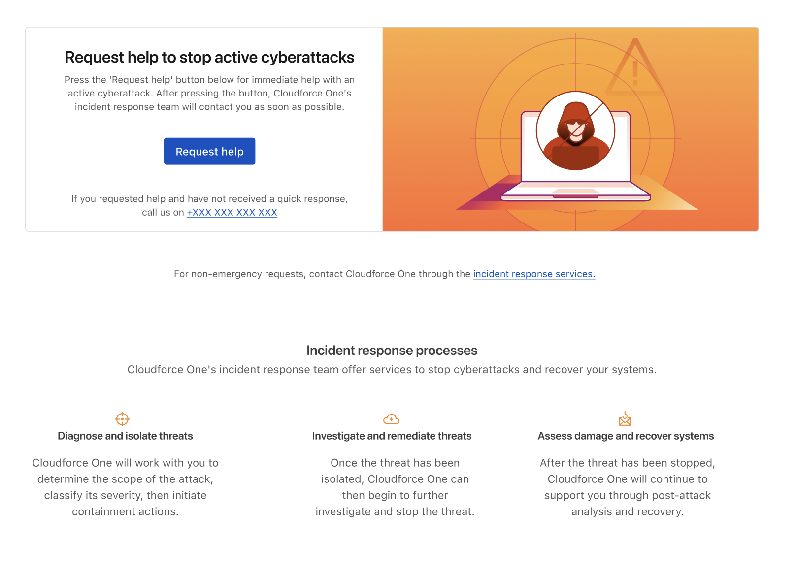
Active attack underway. Every second matters. The user needs to reach a human expert immediately. They have no capacity to parse options, evaluate services, or navigate a form with multiple branches.
User state B
Recovering or preparing
The immediate crisis has passed, or hasn't happened yet. The user has time to read what services are available and submit a considered request.
Starting with empathy mapping
The project began with a content strategy workshop to map the emotional and cognitive state of each user type before making any decisions about structure, hierarchy, or copy.
Two content principles emerged clearly from this session and shaped every subsequent decision:
-
01
Emergency CTAs must be clear and linear
A user in a panic cannot be presented with choices that require evaluation. The primary CTA for emergency services needed to be singular and unambiguous. The user should not have to hunt to find these services. Any additional context or options had to come after the action, not before it.
-
02
Urgent and non-urgent services must live in separate spaces
Placing both service types in the same view risks overloading a panicked user with irrelevant options at the worst possible moment. Keeping emergency contact and non-urgent advisory services structurally separate ensures that a user in crisis is never distracted by content that isn't relevant to their immediate need.
From wireframes to high-fidelity content iteration
Following the workshop, I translated the content principles into low-fidelity wireframes. These established the general content patterns that the product designer could then translate into high-fidelity designs.
Emergency incident dashboard
For the emergency contact dashboard, the content work focused on reducing friction to zero. The primary action of contacting a REACT responder needed to be reachable in as few steps as possible, with no surrounding copy that required reading before acting.
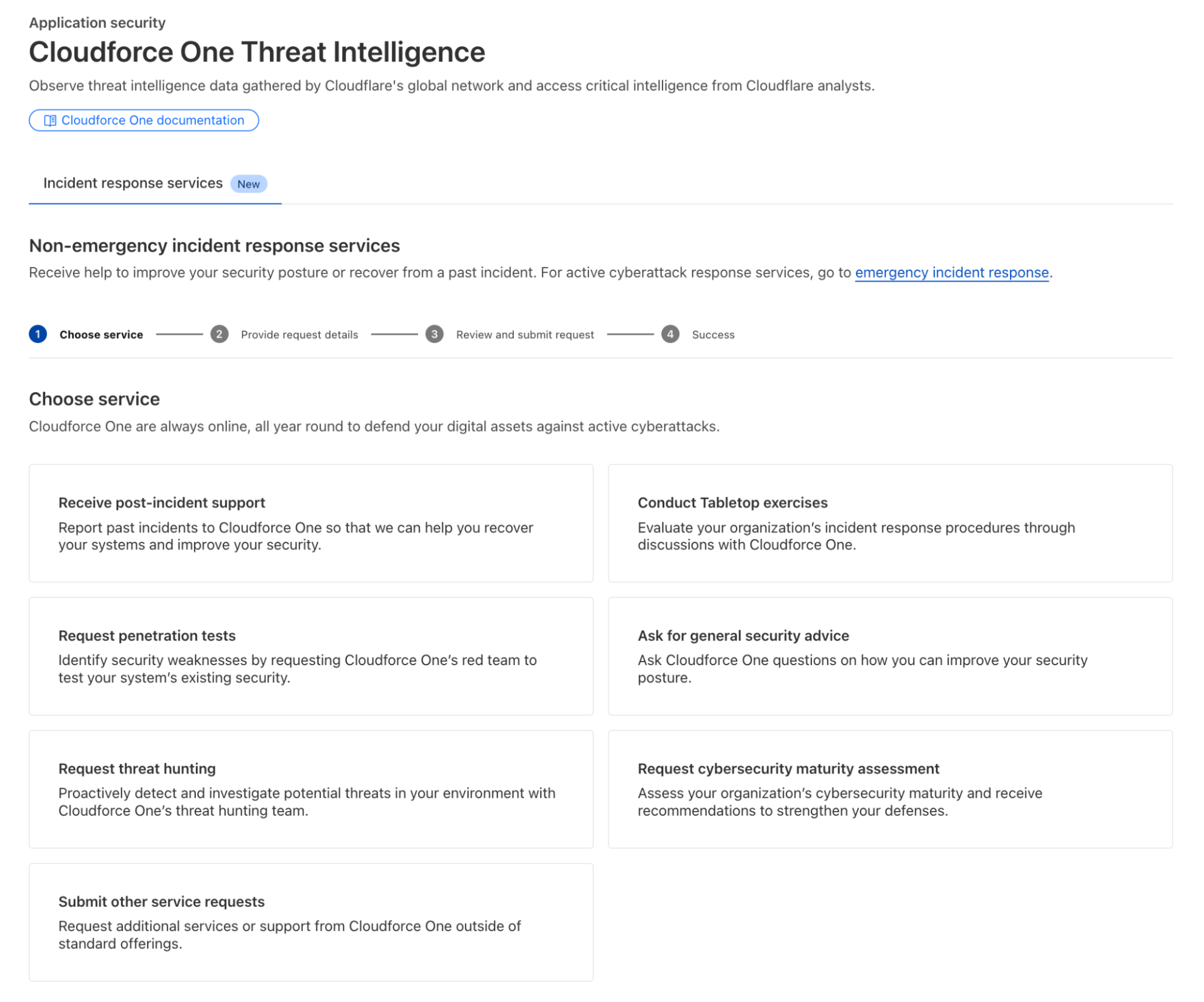
Post-incident and advisory services form
The non-urgent services form presented a different content design challenge. The service covers a broad range of offerings, such as proactive threat hunting, tabletop exercises, incident readiness assessments, and post-incident support. Each of these requires different information from the customer.
Rather than presenting a single long-form request, I helped design a multiple-choice selection at the start of the form. This structure serves two purposes: it gives users a clear overview of what services are available, and it allows the form itself to change dynamically based on the service selected, surfacing only the fields relevant to that specific request.
Throughout the high-fidelity design phase, I continued to iterate on both copy and content structure in parallel with design, refining labels, adjusting hierarchy and ensuring that the language accurately reflected what each service delivers without overpromising or creating ambiguity about scope.