Troubleshooting guidance for millions of users per day
- Problem
- Turnstile and Challenge pages reach millions of visitors a day, most of whom have never heard of Cloudflare. When verification failed, they had no way to fix it.
- Solution
- I led a content review across both products, rewrote every widget state and redesigned troubleshooting so visitors could fix problems without contacting support.
- Outcome
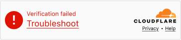
- Every error state now names the likely cause and links to plain-language troubleshooting, replacing a 'Send feedback' dead end.
What are Challenge Pages and Turnstile widgets?
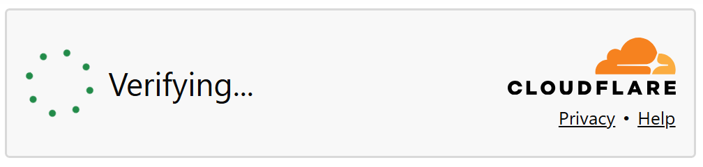
Turnstile is Cloudflare's alternative to traditional CAPTCHAs, a lightweight verification widget embedded by website owners into their sites. Challenge pages are the full page screens shown when Cloudflare's Application Security stops a request and asks the user to verify themselves. Both are among the highest-traffic surfaces Cloudflare operates.
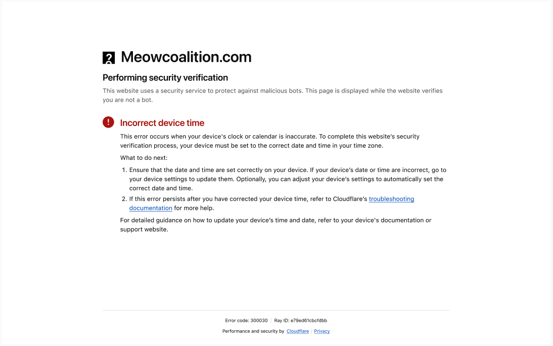
Challenge pages and Turnstile widgets are primarily seen by end users who are not Cloudflare customers. They may have never heard of Cloudflare. When they hit a widget error or a challenge page, they may not know what's happening or why. Every word on screen needs to make sense to someone with zero context.
User research
As part of this update, we conducted interviews to test how users responded to the existing verification language when compared with proposed alternatives. We discovered where the existing copy went right and went wrong. Below are some examples of feedback that we used to improve the existing experience.
Error-state calls to action were unclear
'Verify you are human' worked well, but participants could not tell why an error had happened.
Technical terminology was not always clear
Error states that used terms such as "Domain" were not clear to some users. Terms such as "Website" were easier to understand for these users.
The 'Send feedback' button was not useful
In the existing widget, the call to action after certain errors would be 'Send feedback'. Some participants mentioned they would prefer to troubleshoot by themselves before sending feedback, while other participants highlighted that the recipient of the feedback was not clear.

Helpful content in an extremely small space
Widget size constraints
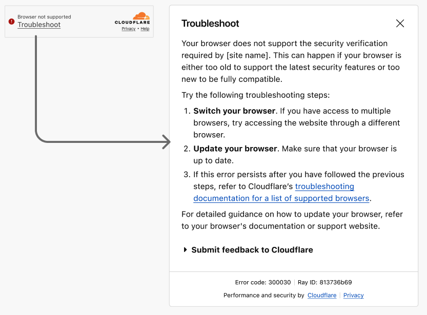
Every error state, fallback message, and action label had to communicate clearly within the fixed dimensions of the widget. Anything that couldn't be said concisely had to be offloaded to a linked troubleshooting page.
Translation requirement
The copy for the new designs would be sent for translation into all supported languages once finalised. A word that is short in English may be much longer in another language. This meant locking in the wording before implementation, as changes after the fact would be costly.
Shared troubleshooting doc across two surfaces
The same troubleshooting documentation page would be linked from both widget error states and the new challenge page designs. It had to work for both contexts and be written for non-technical users.
A new content system for three different experiences
The project covered three distinct but interconnected areas of content work, each requiring its own approach.
01
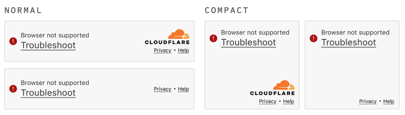
Turnstile widget states
Widget states that need to offload troubleshooting information
02
Challenge pages redesign
Full browser pages that have room for helpful content without requiring additional clicks
03
Troubleshooting and FAQ
Further troubleshooting and help documentation oriented towards non-developer visitors.
Content challenges and solutions
Who does the feedback form send feedback to?
The feedback report form which appears in certain Turnstile failure states allows users to flag issues when the widget isn't working. During the content review, it became clear that users had no way of knowing whether their feedback was being sent to the website owner or to Cloudflare. This ambiguity could lead to users requesting help from Cloudflare for issues that do not originate from Cloudflare.
The fix: name the recipient in the form's intro copy, so users know who they are contacting before they submit.
Writing errors for users with no technical knowledge
Many error states were written for developers. I reviewed copy across widgets, pages and documentation to remove jargon.
Adding extra information on top of other states
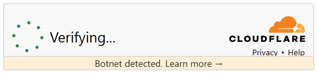
Cloudflare's security can detect when a visitor's device has been infected with malware that attacks websites or applications. These attacks work by coordinating large numbers of infected devices, often without their owners' knowledge. This type of malware is known as a botnet.
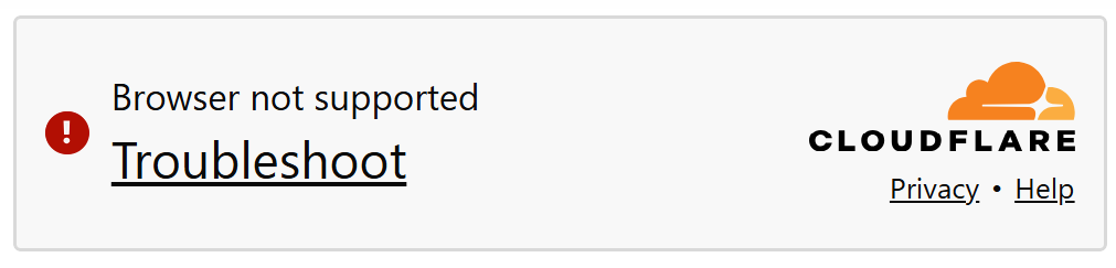
Once the main content of the security verification pages and widgets was updated, work began on how to inform visitors that their device had been flagged for botnet activity. This notification is purely informational and does not block users from completing verification as normal.
The widget's size could not change, so the notice had to fit inside the existing layout. The message links to unbotnet.me, which explains botnets in plain language for a non-technical audience.