Unifying Cloudflare's application security dashboard
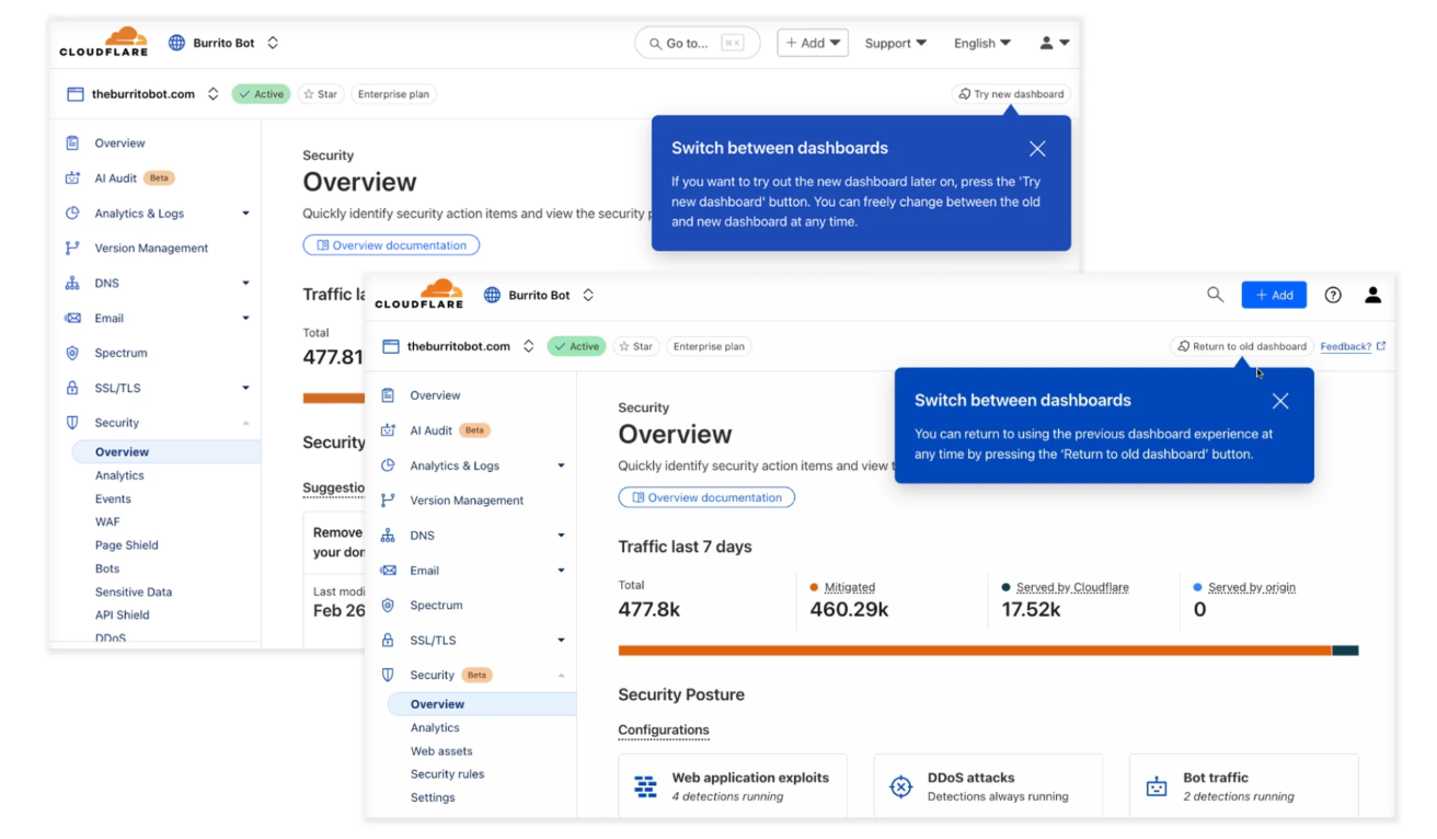
Cloudflare's application security tools were spread across disconnected dashboards, each named after its product rather than what it solved. In March 2025, we launched a new dashboard that unified these workflows into a single, coherent experience. I led the content strategy initiative to help unify concepts, language, naming conventions, and information architecture that shaped how thousands of users understand and act on their security posture.
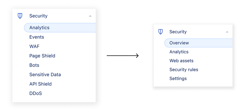
Security tools were named after products, not solutions
Cloudflare's application security features had grown across separate product spaces, each with its own dashboard, terminology, and navigation. To find the right tool, users first had to know which product it belonged to, then relearn an entirely new UI layout each time. Investigating a single security event often meant switching contexts between multiple dashboards.
The goal of the dashboard unification project was to identify the common user journeys between these tools, then bring them together into a single experience based on the user's needs. Organised by the threats they address rather than the product lines that built them. My role as a UX content designer was to define the language and content strategy that would make this structure feel coherent, and to design the change management content to onboard an existing user base into a meaningfully different experience.
Building content guidelines
Before any copy could be written, I conducted a language audit across the existing dashboard. This involved mapping where terminology was shared across products, where it diverged, and where introducing new terms would create friction for existing users.
Clear guidance on a complex security posture
An updated security overview was introduced with this launch, providing customers with insights into their security posture along with recommendations on how to improve it. With any system like this, providing clear and succinct guidance on what a user should do, and where they need to go to do it, requires strong content design.
With dozens of recommendations spanning each area of security, a content guideline was key to ensure consistency across the experience and reduce the risk of conflicting or confusing messaging. I developed this guideline and applied it across the full set of recommendation cards at launch.
Helping users mitigate security threats
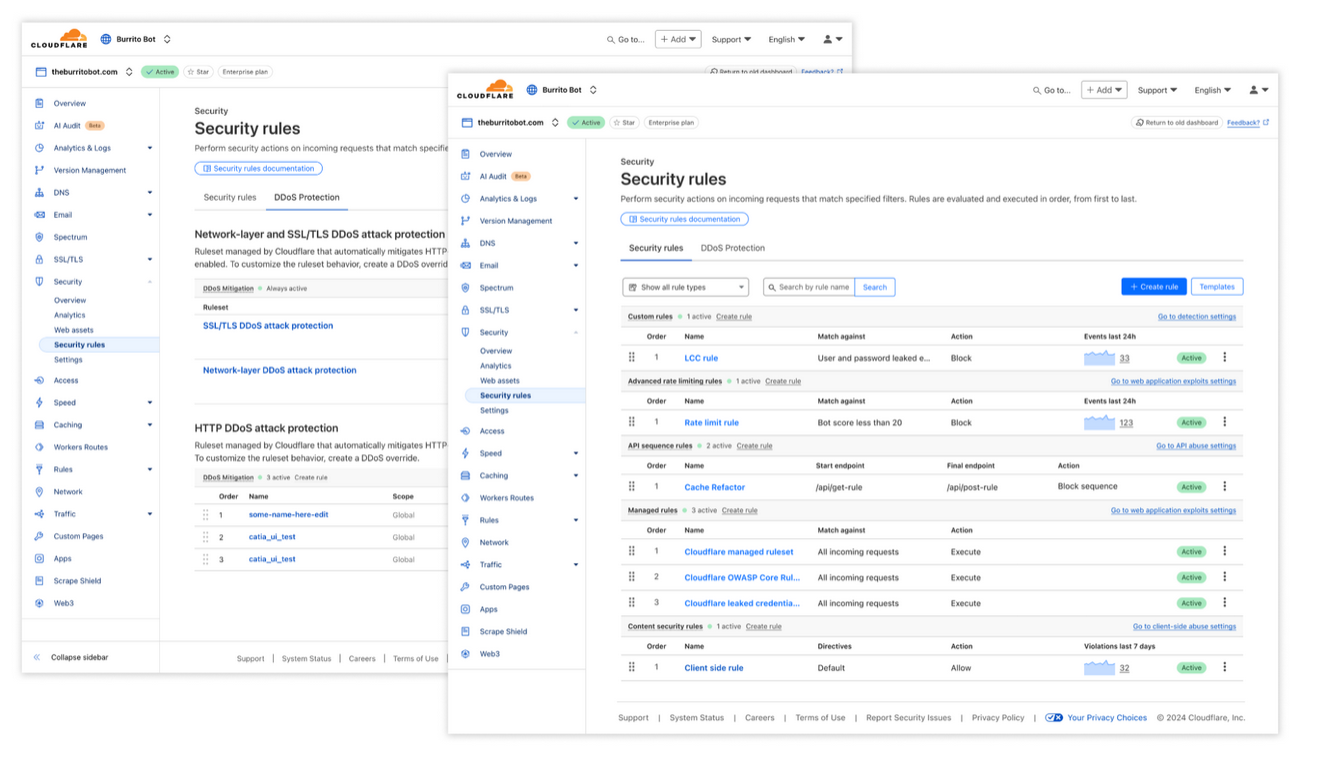
As part of the new security dashboard, multiple security products including API Shield and Page Shield had their onboarding content removed from individual product dashboards and consolidated into a unified rules experience. With onboarding content no longer living in its original home, the rules page needed a content strategy that could guide users through the full journey from discovery to creation.
The strategy centred on three moments: discovery, creation, and templates. Each required a different content approach depending on where the user was in their journey and what they already knew about rules.
Discovery
Users come to the rules page from different starting points. Those who want to learn may arrive through documentation. Those already familiar with rules dive straight into the creation flow. Those who want a quick starting point reach for templates. The content strategy was designed to serve all three without requiring users to navigate between them.
Creation flow
Rules are grouped by their primary function. After pressing the create rule button, a list of available rule types is shown, each accompanied by a tooltip and a brief description of its purpose. Once inside the creation flow, the user sees a longer description alongside a documentation link specific to that rule type.
Templates
The templates sidebar presents ready-made rule templates grouped by their primary function. Each template card title is written to describe the outcome the rule provides, with a supporting description explaining how it works. The writing approach here prioritised outcome-led language so users could quickly identify the template relevant to their situation without needing to understand the underlying rule mechanics first.
Documentation strategy for a gradual change
When the new dashboard launched as a beta, a proxy tile was added to direct confused users whose existing documentation no longer matched the new UI. As the dashboard moved toward becoming the default experience for all users, that stopgap was no longer enough. I worked with tech writers to develop a documentation strategy that would support the influx of users throughout multiple stages of this dashboard shift.
The problem was threefold: existing docs could not be searched using the new tool names, step-by-step guides only described the old dashboard, and product references throughout used legacy naming. A completely new docs IA was the right long-term answer, but during the period when both the old and new dashboard were available at the same time, the goal was to close the most critical gaps first.
What we prioritised
- Introductory descriptions updated to reference new feature names where they existed, either inline or as a note on the page
- Dashboard procedures updated so that both old and new dashboard instructions existed side by side, using a tabbed format to separate them cleanly
- Search synonyms added for new terminology so users searching with old product names could still find the right page
- The security dashboard proxy tile was prepared for the new dashboard so its content could be made fully searchable
How we structured the tab format
For pages with long dashboard guides, we introduced a tabbed structure separating old and new dashboard instructions. This preserved existing content for users still on the old dashboard while giving new dashboard users a clear, up-to-date path. The tab approach mirrored an existing pattern already used in the docs for dashboard versus API guides, which meant it required no new infrastructure and was immediately familiar to readers.
For pages with only minimal dashboard guidance, a simpler inline approach was used, adding a short bullet pointing users to the equivalent location in the new dashboard without restructuring the full page.
The opt-in launch gave us confidence to continue
The new dashboard launched in Q1 2024 and moved to default for all users at the start of Q3. Adoption rose steadily through the quarter. Most users who opted in never opted out. Those who did opt in in were measurably more successful at core security tasks. We received a large amount of helpful feedback through both surveys and user interviews that allowed us to continue to revise the UX of this new dashboard further.